The Ultimate Beginner-Friendly Guide to Ecommerce Cohort Analysis
TL;DR
- Looking at total revenue and total customers hides the truth about which customers are actually loyal and profitable.
- A cohort is a group of customers who share the same starting point, like everyone who first purchased in January.
- Acquisition cohorts show retention, spend, and quality of customers based on their first purchase month.
- Purchase frequency cohorts reveal how often customers return and where your retention is leaking.
- Retention curves visualize what percentage of a cohort keeps buying month after month.
- Cohorts reveal which campaigns attract high-LTV customers and which channels produce one-time buyers.
- Karbon Analytics automatically builds acquisition and repeat-purchase cohorts, visualizing retention curves and showing which channels bring high-LTV customers.
Why Totals Hide the Truth
Here is a scenario you might recognize. Your Shopify dashboard shows $50,000 in revenue this month. You acquired 500 new customers. Everything looks great.
But here is what those totals do not tell you:
- Are those 500 customers going to buy again, or did they make one purchase and disappear?
- Which month brought in customers who actually stick around?
- Are your Facebook campaigns bringing in loyal customers or one-time buyers?
- How long does it take to recoup what you spent to acquire each customer?
The problem:
Most brands do not actually know which customers are loyal or profitable. They see totals and assume growth is healthy. But totals can hide a leaky bucket where customers churn faster than you can replace them.
Cohort analysis breaks customers into groups so you can see loyalty and profitability clearly. Instead of asking "How much revenue did we make?", you ask "How much revenue did the January cohort generate over time?" This reveals who sticks, who churns, and who is worth scaling.
What Is a Cohort?
A cohort is simply a group of customers who share the same starting point.
Simple examples:
- "People who bought for the first time in January"
- "People who subscribed this week"
- "Customers who first purchased from a TikTok ad"
- "Everyone who joined during Black Friday"
By grouping customers this way, you can track how each group behaves over time. Did the January cohort come back in February? March? How much did they spend in each month? This is what cohort analysis reveals.
Acquisition Cohorts
Acquisition cohorts measure retention, spend, and quality of customers based on their first purchase month. They answer: "Did the customers we acquired in January turn into repeat buyers?"
What to Track
- Month 1 repeat purchase rate: What percentage of the cohort placed a second order?
- Month 2 repeat purchase rate: How many came back for a third order?
- Month 3 repeat purchase rate: Are they still engaged?
- Revenue expansion or decay: Does revenue from this cohort grow or shrink over time?
Example: January Acquisition Cohort
- January: 100 customers, $10,000 revenue
- February: 35 customers returned (35% repeat rate), $4,200 revenue
- March: 28 customers returned (28% repeat rate), $3,500 revenue
- April: 22 customers returned (22% repeat rate), $2,800 revenue
This shows a healthy retention curve where about one-third of customers return each month.
Why It Matters
Acquisition cohorts help you:
- Identify strong and weak acquisition months: Maybe your March cohort has a 45% Month 1 repeat rate, but your June cohort only has 15%. That tells you something changed.
- Evaluate ad campaign quality: Did that Facebook campaign bring in customers who buy once and disappear, or customers who become loyal repeat buyers?
- Spot seasonal patterns: Do holiday shoppers stick around, or do they churn faster than regular customers?
Purchase Frequency Cohorts
Purchase frequency cohorts track how often customers return after their first order. They answer: "How many of our customers are one-time buyers versus repeat buyers?"
What to Show
- Percentage of customers who place a second order: This is your repeat purchase rate.
- Time between purchases: How many days on average until the second order?
- Distribution of 1-time vs multi-time buyers: What percentage of customers never return?
- Average order count per customer: Do most customers buy 2 times? 3 times? 5+ times?
Example breakdown:
- 60% of customers are one-time buyers
- 25% of customers place 2 orders
- 10% of customers place 3-4 orders
- 5% of customers place 5+ orders
This distribution shows where your retention is leaking. If 60% never return, that is a problem worth fixing.
Why It Matters
Purchase frequency cohorts reveal:
- Where retention is leaking: If most customers never place a second order, your acquisition strategy might be attracting the wrong people, or your post-purchase experience needs work.
- How long it takes to recoup acquisition costs: If customers take 90 days to place a second order, but your average customer lifetime value (LTV) calculation assumes they buy monthly, your numbers are off.
- Which products create sticky customers: Do customers who buy Product A return more often than customers who buy Product B?
Retention Curves
A retention curve shows what percentage of a cohort keeps buying month after month. It is the visual representation of customer loyalty.
How a Healthy Retention Curve Looks
A healthy retention curve typically shows:
- Month 0 (first purchase): 100% of the cohort
- Month 1: 30-40% return (this is normal - many customers need time)
- Month 2: 20-30% return
- Month 3: 15-25% return
- Month 6+: The curve flattens, with 10-20% still active
Healthy curve pattern:
The curve drops quickly in the first few months (normal churn), then flattens. A flattening curve is actually good news - it means you have found your core loyal customers who stick around long-term.
What a "Churned" Curve Looks Like
A problematic retention curve shows:
- Rapid drop-off: 80%+ of customers gone by Month 2
- No flattening: The curve keeps dropping month after month
- Very low Month 1 repeat rate: Less than 20% return
Warning signs:
If your retention curve never flattens and keeps dropping, you are likely acquiring low-quality customers or failing to engage them after the first purchase.
How Cohorts Reveal True Loyalty & Profitability
You cannot judge customer quality by ROAS alone. A campaign might show 4x ROAS, but if those customers never return, you are not building a sustainable business.
Key insight:
True loyalty shows up in cohorts, not dashboards. A dashboard tells you what happened. A cohort tells you who is still around.
Insights Cohorts Reveal
- Which campaigns attract the highest LTV customers: Maybe your Google Search campaigns bring in customers with a 50% Month 1 repeat rate, while your TikTok campaigns only bring in 15%. That tells you where to invest.
- Which product lines produce sticky customers: Customers who buy your subscription product might have an 80% Month 1 repeat rate, while one-time product buyers only have 20%.
- Which months or years bring in customers who churn faster: Your Black Friday cohort might have high initial revenue but low retention, while your organic search cohort has lower initial revenue but much better retention.
- Time to profitability: Cohorts show how long it takes for a customer to become profitable after you account for acquisition costs.
Practical Examples
Example 1: High AOV, Low Repeat Rate
A beauty brand's January cohort shows:
- Average order value: $120 (high)
- Month 1 repeat rate: 12% (low)
- Month 2 repeat rate: 5% (very low)
What this means: These customers spend a lot on their first order, but they do not come back. This suggests the product might be a one-time purchase, or the post-purchase experience is not encouraging repeat buys.
Action: Focus on cross-sell and email sequences to drive second purchases. Consider subscription options or loyalty programs.
Example 2: TikTok Customers Churn After One Order
A fashion brand tracks cohorts by acquisition channel:
- TikTok cohort: 200 customers, 8% Month 1 repeat rate
- Email cohort: 150 customers, 45% Month 1 repeat rate
- Google Search cohort: 180 customers, 38% Month 1 repeat rate
What this means: TikTok is bringing in customers who buy once and disappear. Email and Google Search are bringing in more loyal customers.
Action: Reduce TikTok spend or change the creative/messaging to attract customers who align with your brand long-term. Increase investment in email and Google Search.
Example 3: Email-Acquired Customers Have Best Retention
A home goods brand finds:
- Email-acquired customers: 55% Month 1 repeat rate, 40% Month 2 repeat rate
- Paid social customers: 22% Month 1 repeat rate, 12% Month 2 repeat rate
What this means: Email marketing is bringing in customers who are already engaged with your brand. They have higher intent and better retention.
Action: Invest more in email list growth and lifecycle campaigns. Use email-acquired customer behavior as a benchmark for paid channels.
How to Build Ecommerce Cohorts
Here is a simplified step-by-step process for building your own cohort analysis:
Step 1: Group by First Purchase Month
Export your customer data from Shopify. Group customers by the month they made their first purchase. This creates your acquisition cohorts.
Example: Everyone who first purchased in January 2025 is the "January 2025 cohort."
Step 2: Track Repeat Purchases Each Following Month
For each cohort, count how many customers placed a second order in Month 1, Month 2, Month 3, and so on.
Example: Of the 100 customers in the January cohort, 35 placed a second order in February (Month 1), 28 placed a third order in March (Month 2).
Step 3: Build a Retention Table
Create a table with:
- Rows: Each cohort (January, February, March, etc.)
- Columns: Month 0, Month 1, Month 2, Month 3, etc.
- Values: Percentage of cohort that purchased in each month
Sample retention table:
| Cohort | Month 0 | Month 1 | Month 2 | Month 3 |
|---|---|---|---|---|
| January | 100% | 35% | 28% | 22% |
| February | 100% | 42% | 31% | 25% |
Step 4: Calculate Average Order Count per Cohort
For each cohort, calculate the average number of orders per customer over time. This shows purchase frequency.
Example: The January cohort has an average of 2.3 orders per customer after 6 months.
Step 5: Highlight Where Curves Break
Look for cohorts where retention drops significantly compared to others. These are your problem areas.
Example: If your June cohort has a 15% Month 1 repeat rate while other months average 35%, something changed in June that hurt customer quality.
Common Mistakes
- Looking at totals instead of cohorts: Total revenue tells you what happened, not who is still around. Always break down by cohort.
- Mixing new vs returning customers: Do not combine first-time buyers with repeat buyers in your analysis. They behave differently.
- Assuming high ROAS equals high-quality customers: A campaign with 5x ROAS might bring in customers who never return. Check the cohort retention.
- Ignoring time-to-second purchase: If customers take 120 days to place a second order, but you calculate LTV assuming monthly purchases, your numbers are wrong.
- Not separating new vs repeat revenue: Track revenue from new customers separately from revenue from returning customers. This shows true growth vs retention.
- Analyzing cohorts too early: Give cohorts at least 3-6 months before drawing conclusions. Early data can be misleading.
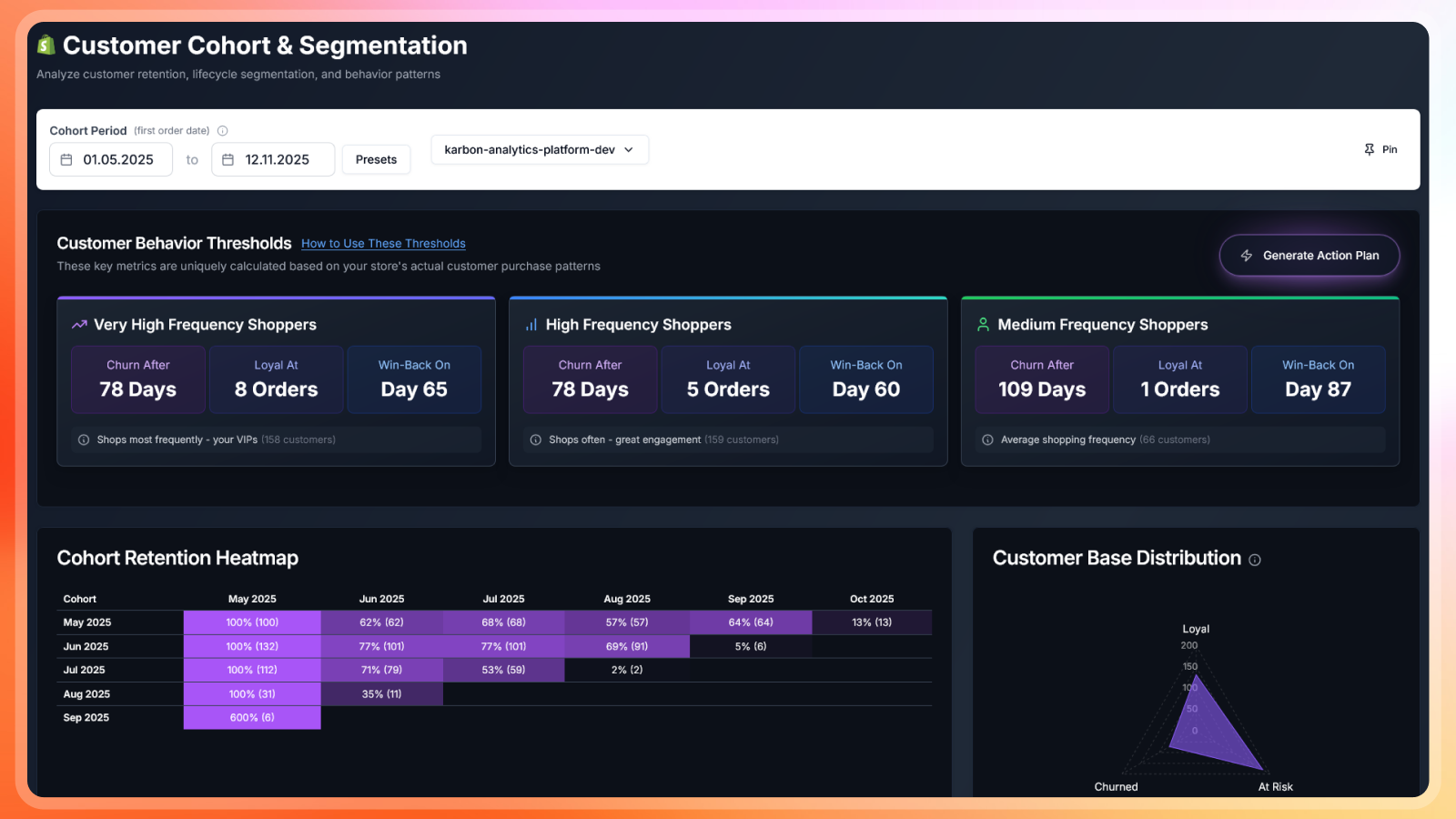
How Karbon Analytics Helps
Building cohorts manually in spreadsheets is time-consuming and error-prone. You have to export data, group customers, calculate retention rates, and update everything monthly.
Karbon Analytics automatically builds acquisition and repeat-purchase cohorts for your Shopify store. It visualizes retention curves and purchase frequency, so you can see which customers stick around and which channels bring in high-LTV customers.
What Karbon shows you:
- Retention curves for each acquisition cohort
- Purchase frequency distribution (1-time vs multi-time buyers)
- Cohort performance by acquisition channel
- Average order count per cohort over time
- Revenue expansion or decay by cohort
Karbon sends you insights like:
- "Your July cohort is outperforming your average retention by 22%."
- "Meta campaigns are driving customers with the highest Month 2 repeat rate."
- "TikTok-acquired customers have a 15% lower repeat purchase rate than your average."
- "Your January cohort has an average of 3.2 orders per customer, compared to 2.1 for your overall average."
This helps you make data-driven decisions about where to invest your marketing budget and which customers are worth scaling.
If you want to see your store's cohorts instantly without building spreadsheets, try Karbon Analytics.
Conclusion
Cohort analysis is the simplest way to understand loyalty and profitable growth. It reveals which customers stick around, which channels bring in high-quality customers, and where your retention is leaking.
Stop looking at totals and start looking at cohorts. Your business will thank you.